Objective:
Assist with the user interface of a new HR platform that facilitates learning and performance.
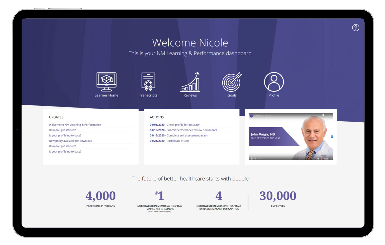
In Chicago, I had a solid relationship with the Leadership and Organizational Development Director for Northwestern Medicine. As an HR leader, one of her last projects was to roll out a new organization-wide learning and performance toolkit. As the deadlines approached, I was able to step in and provide creative direction with custom HTML to help showcase the new software and keep the system on brand.
The system platform utilized template setup with areas that can be arranged using pre-built widgets or custom WYSIWYG (What You See Is What You Get) boxes. As a frontend designer, I completely despise these things because they encourage users to muck up our beautifully crafted style standards. There’s a reason we set the rules for type treatment. However, the WYSIWYG worked out to our favor because there’s always a source option to write your own HTML. In addition, I was able to upload images to the server using the image upload widget which I then could reference using inline CSS.
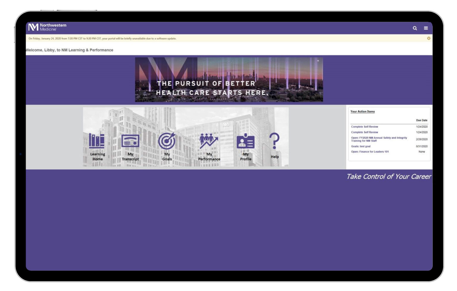
The result was a much more user-centric and action-oriented landing page.
As with all new tools, getting buy-in from users is paramount. Had they left the entry page “as is” the success of the whole initiative would have been affected.
Now the marketing team wasn’t too happy with my HTML/CSS wizardry. But my loyalties lie with the home team and NM leadership definitely appreciated the effort. I even joined a training session to teach the team how to make edits and keep the new layout intact.
Before & After


