Objective 1:
Create a modern, responsive website with integrated inventory ordering tools to assist loyal retailers.
Since 1982, Fox Outdoor Products has been a direct importer and distributor of military, tactical and outdoor gear. Fox offers nearly 5,000 items under 7 brands. Fox products are sold at retailer shops nationwide.
My first project was to rebuild foxoutdoor.com to showcase products and provide online order management. At the time, the senior product designer claimed, “We will be lucky to sell one product a month with this website.” The owner disagreed and we pressed forward launching in late 2010.
In 2011, the website generated $1,684,000.
In 2012, that number rose to $2,232,000.
In 2013, $2,405,000 and so on…
Objective 2:
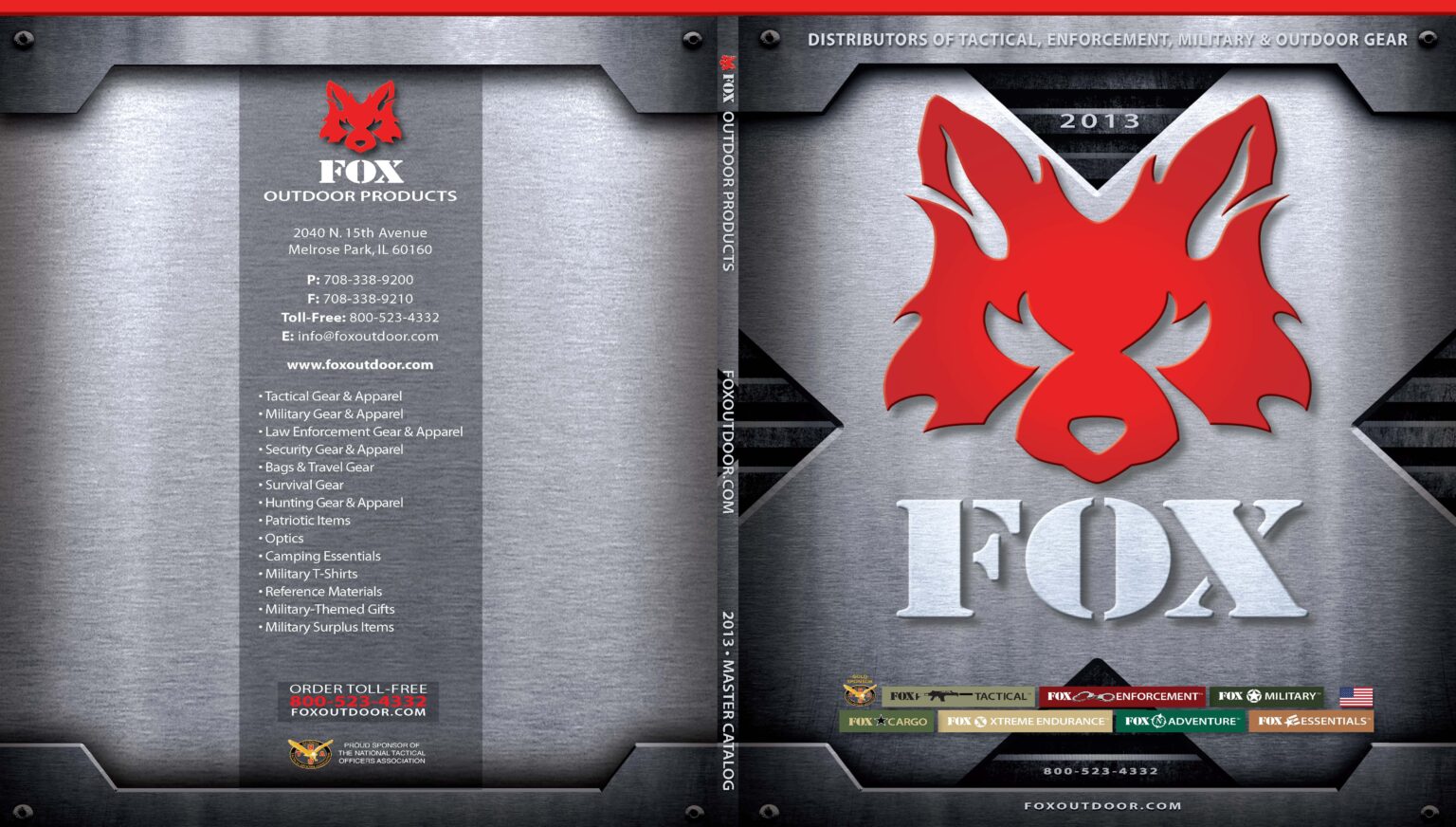
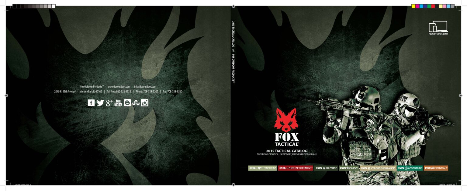
Redesign a 300+ page product catalogue from scratch.
This was a great opportunity to tap into my graphic design experience from the newspaper. I was in that “I’ll take anything” phase of my creative career. I had very little experience with Adobe InDesign but understood what needed to be done to produce the final product. I had a lot to learn. And fast.
Starting from scratch is never easy. The previous designer did not provide source files or imagery. I had to pull all the images from DVDs and content from individual Word documents. Thousands of documents and images! Big thanks to Kelsey Adams for being my partner in crime. I couldn’t have done it without you.
Lets talk about the design adjustments. This is what I did:
- Flipped the orientation of the catalog to landscape. This provided a panoramic-style canvas that we could use to our advantage. It also created a horizon line that resembles a shelf with products moving from left to right.
- Mimicked the product catalogues of Under Armour and Nike to standardized the layout making it easy for retailers to find information. New templates followed this pattern for consistency. Everything matched the website in terms of styles and organization.
- Added magazine-style feature pages to promote best sellers, featured products, and new items/colors/sizes.
The previous design lacked structure and was cluttered. Images often competed with products leaving no real focal point or hierarchy.
The end result was a cleaner, organized and more polished catalogue.


